Martin Brothers Funeral Services | The Design of Heritage
2026
Martin Brothers Funeral Services | The Design of Heritage
Martin Brothers is a multi-generational pillar of the Southern Alberta landscape. When an organization carries a century of heritage, its primary communication challenge is not visibility, but alignment.
Martin Brothers Funeral Services | The Design of Heritage
For Martin Brothers Funeral Services
Martin Brothers | The Architecture of Legacy
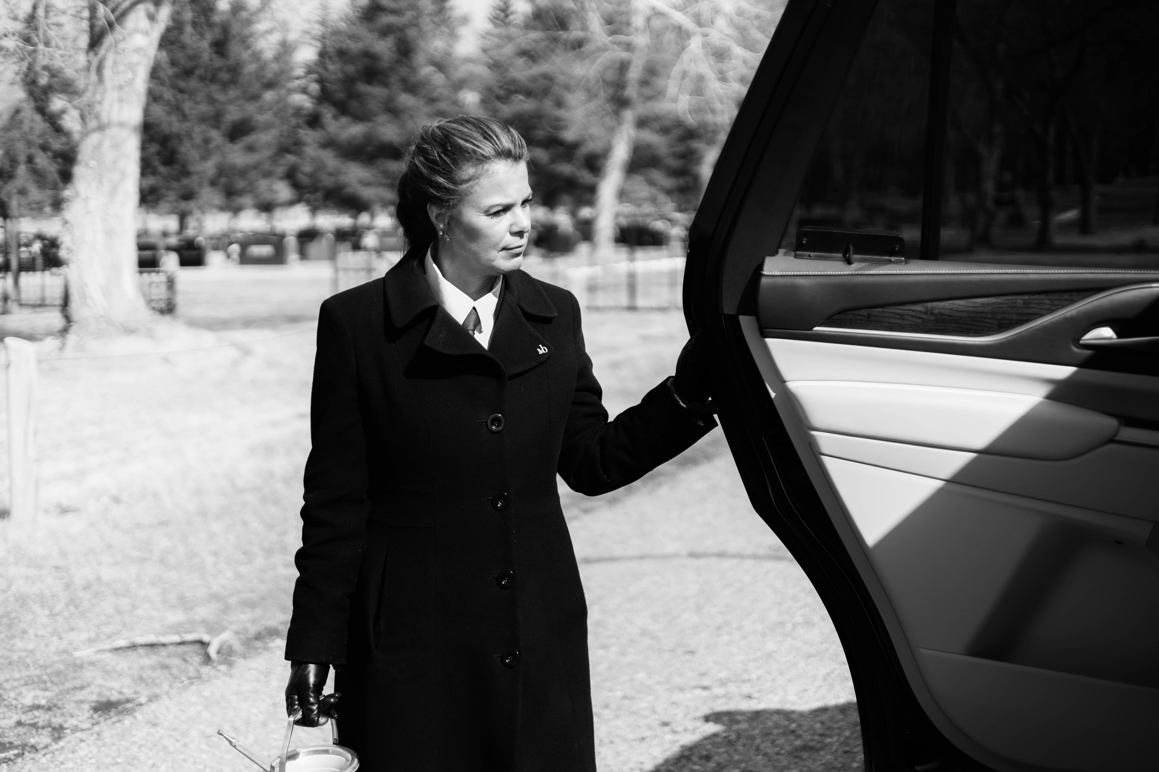
Martin Brothers is a multi-generational pillar of the Southern Alberta landscape. When an organization carries a century of heritage, its primary communication challenge is not visibility, but alignment. The project required a rigorous audit to ensure that their digital infrastructure and visual language matched the operational excellence of their service.
The Diagnosis: Resolving the Alignment Gap
The existing digital presence for Martin Brothers suffered from communication friction. While the firm provided high-touch, empathetic care, the interface through which the community engaged with them was utilitarian and visually dated. There was a significant gap between the value of their heritage and the perception of their brand in a digital context.
To resolve this, we moved past decoration and focused on Narrative Architecture. We needed to build a system that respected the solemnity of the service while providing the modern functionality required for death care in 2026.
The Structural Resolution
The project was executed across three distinct layers of communication:
The Verbal Narrative: We refined the messaging to lead with a "Steady Hand." The copy was stripped of industry clichés, focusing instead on the clarity of process and the depth of heritage.
The Structural Logic (UX): We engineered a high-performance digital platform. This included a complex data migration of thousands of obituaries and condolences from legacy systems into a modern, intuitive hierarchy. We prioritized "Quiet Navigation," ensuring that grieving families could find information without cognitive load.
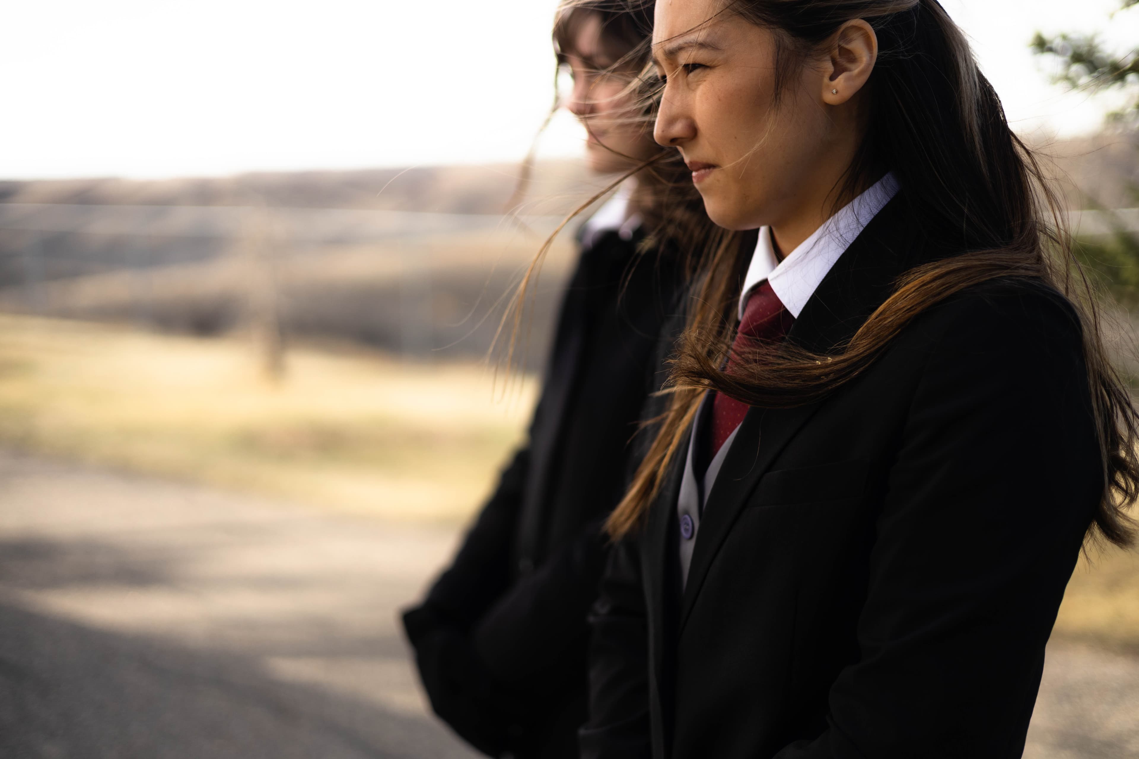
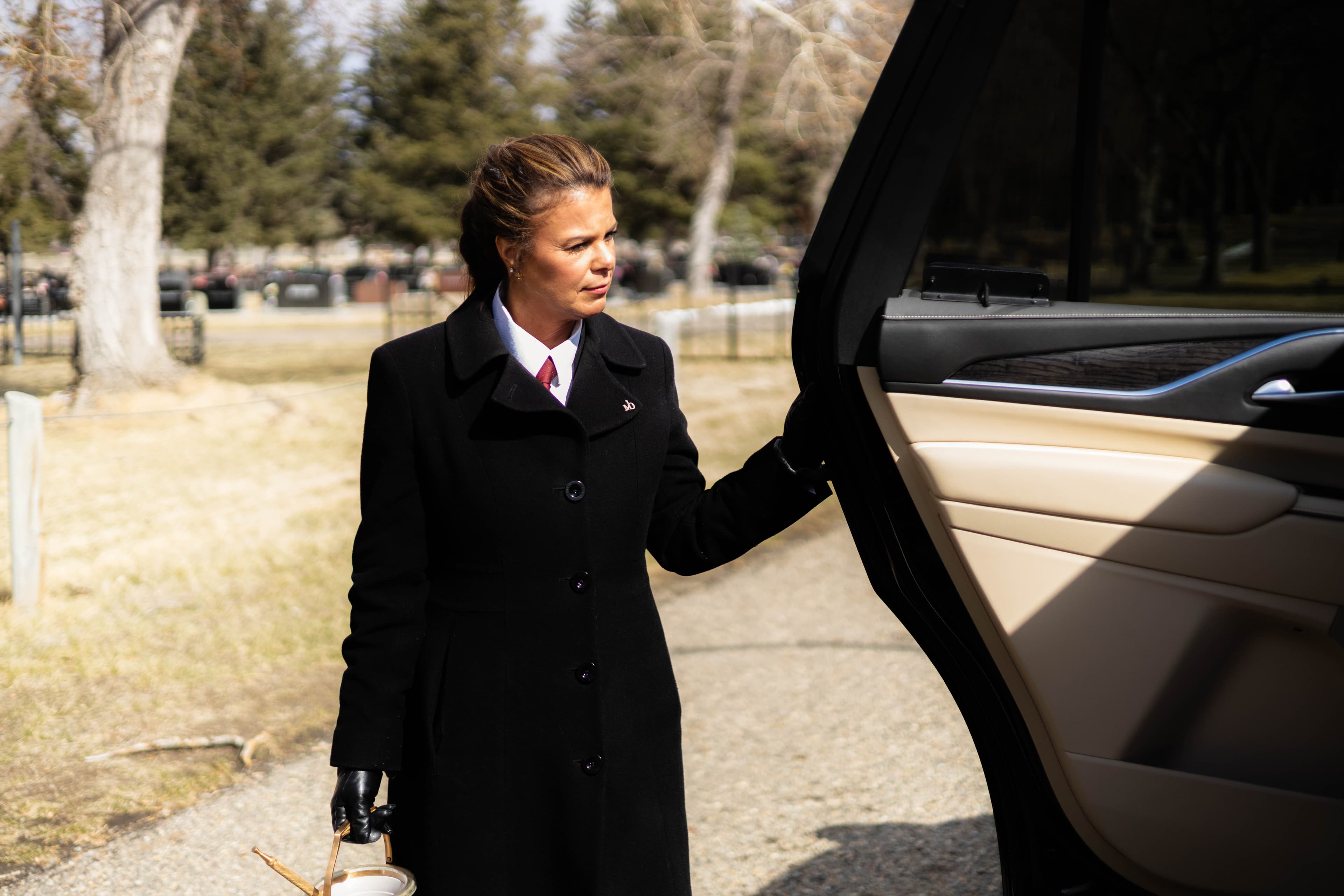
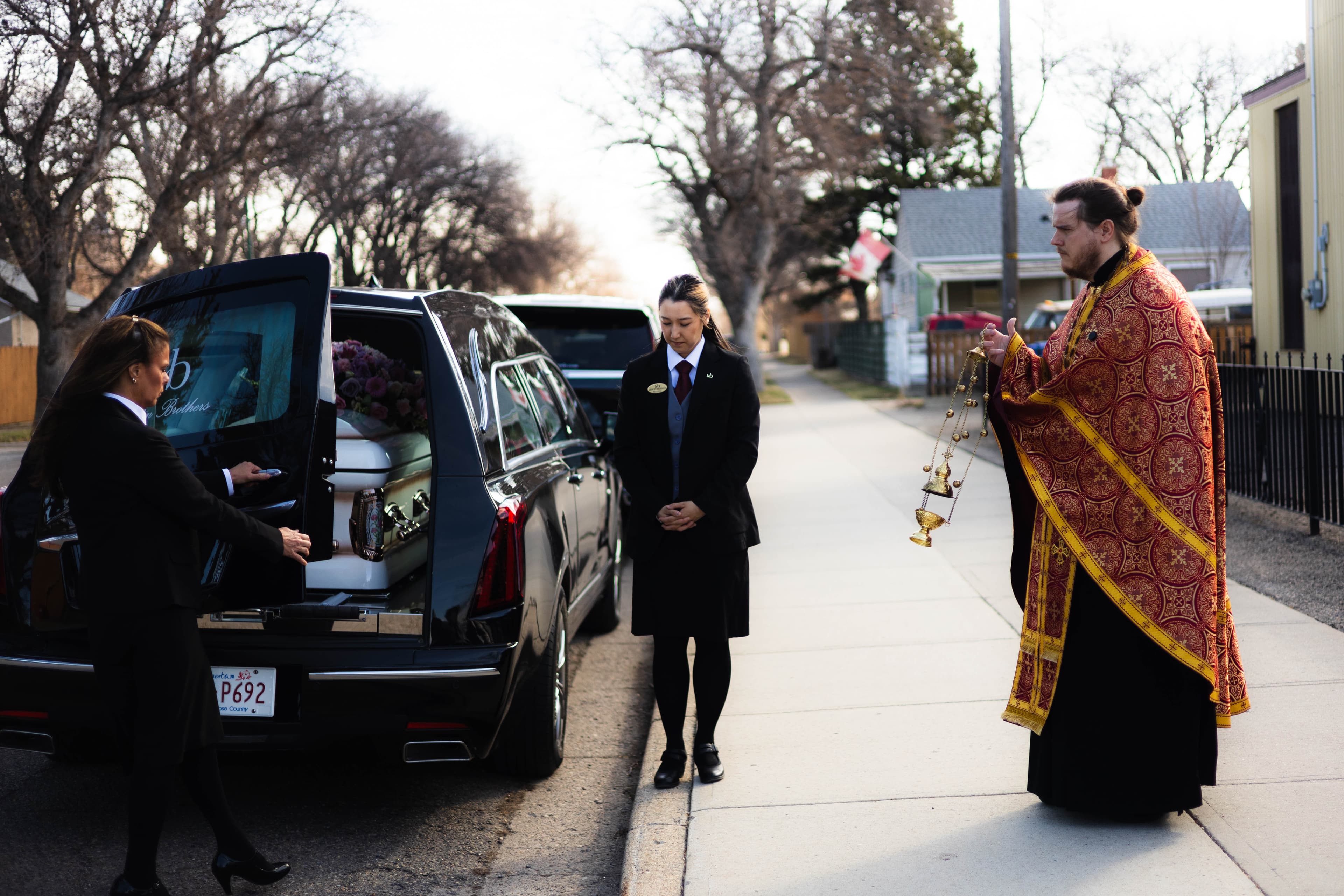
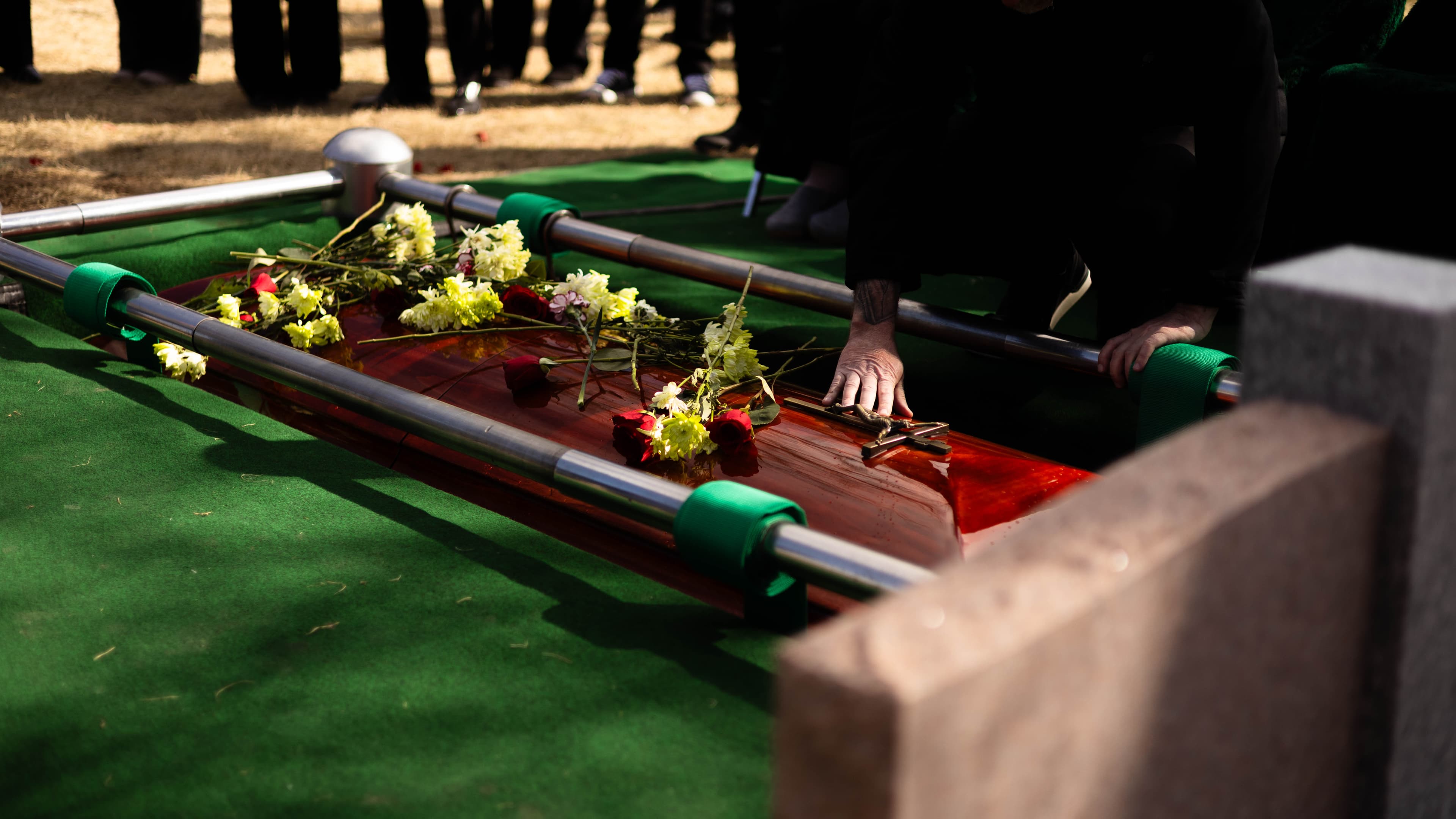
The Visual Identity (Subtlety): We utilized a cinematic approach to art direction. By leaning into Visual Literacy, we employed a palette of chromatic tension—deep, grounded tones and precise typography—that signaled stability and authority. We avoided the "clinical" look of modern corporate design in favor of a timeless, editorial aesthetic.
The Human Frequency
In death care, design is an act of empathy. By treating the website as a communication asset, we transformed it into a bridge for connection. The result was a platform that didn't just display information; it embodied the dignity of the Martin Brothers name.
The redesign successfully closed the Alignment Gap, ensuring that the first point of contact for a family in need was as professional and grounded as the funeral directors themselves.
The Technical Infrastructure
Systems: Custom Web Architecture (Next.js / React)
Execution: Data Migration, Identity Refinement, UI/UX Engineering
Mediums: Digital, Typography, Messaging
Project Assets

Design by people, for people.
Good design is good communications.
This philosophy is not limited by medium; it is a discipline applied to every touchpoint where your message meets its audience. Whether it is a comprehensive brand identity, a high-stakes campaign, or the internal communications that align your team, the objective remains the same: the removal of friction.
Copyright 2026 Adam Thom © All Rights Reserved.
Lethbridge, Alberta, Canada, working globally.